Fixing Underwater Photos Part 3
In Part 1 of Fixing Underwater Photos, I covered how to repair scratches on the photo introduced by the underwater housing, which are essentially defects in your photo caused when the lens takes a picture of the plastic that keeps your camera from getting wet. In Part 2, I showed you how to correct soft focus in an underwater image. Here I'll go over some ways to enhance the color of your underwater photos to make the details pop. As I said at the beginning of this tutorial, some of color correction is a matter of personal taste, so consider the color corrections here a guideline, not hard and fast rules for fixing your images.
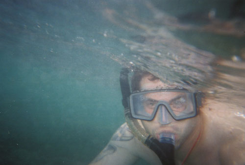
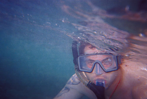
In looking at my original image, the color is a bit green and it looks a bit washed out:
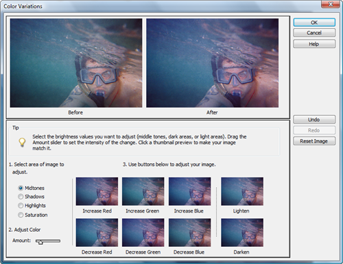
For each part of this color correction, I'm using the Color Variations feature of Photoshop Elements. This is an easy way to enhance the color of your images without having to get too geeky. You can find the tool on the menu by choosing Enhance > Adjust Color > Color Variations.
For each component of the Color Variations, Photoshop Elements lets you move the Amount slider and then select an option. For most cases the default amount is sufficient although you may want to play with different amounts and compare results. If you ever dislike a change, you can either click the Undo button or Restore all changes to default.
Color Variations - Increase Saturation
For the first stage of enhancing color in this photo, I start by selecting Saturation from the options on the left and choosing Increase Saturation.
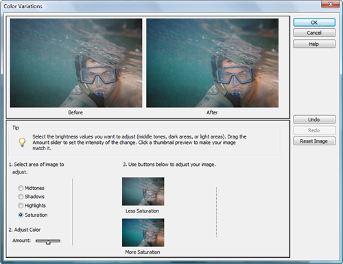
Color Variations - Highlights
For the highlights of the photo, I choose to increase blue and increase red, which brings out just a bit more detail.


Color Variations - Shadows
Next I adjust the shadows in the image, again with increased blue and increased red to override the green in the image.
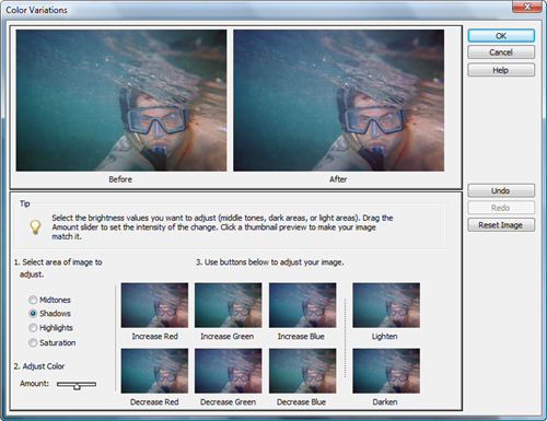
Color Variations - Midtones
The last color variation change I make is to the Midtones. This setting typically has the biggest impact on the overall color of the image, which means a lighter touch is generally advisable. The first step is to move the Amount slider over a couple of notches so that the changes are more subtle. For this particular image, rather than increasing anything in the midtones, I opted to reduce the greens, which balanced the overall red, blue and green hues across the midtones in the image.
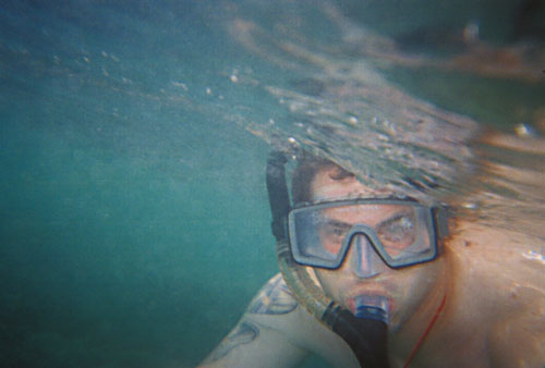
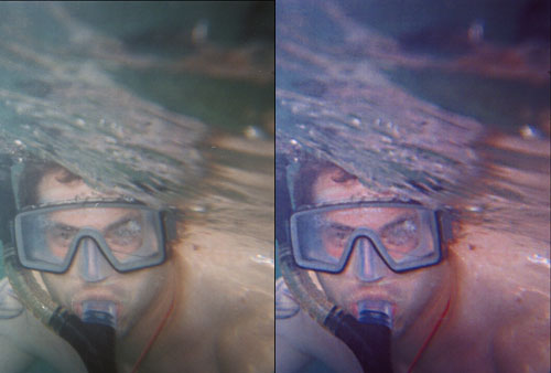
The final image is just a touch on the blue side of the spectrum, with skin tones in the image a little on the pink side (which accurately reflect my sunburn). Here you can see the image comparison side-by-side:
Read Part 1 of Fixing Underwater Photos
Read Part 2 of Fixing Underwater Photos
Find more digital photography tips